Museum Tour App
Dayton Museum of Art
Background
There are millions of children across the nation who need to be educated. Field trips are a great way for children to experience learning in a more interactive environment. One of the most common destinations for field trips would be local museums. Children (as well as many adults) rely heavily on technology to seek out and find information.
Problem
Many museums are understaffed due to budgetary reasons. This causes many locations to have fewer employees for visitors to ask for help. Museums are often large and expansive, leading to difficulty for customers to find certain exhibits or even the restrooms. This could lead to customers getting lost or getting frustrated. Some customers would rather have information about an exhibit read to them rather than reading it themselves. However, this would normally require a museum guide to be hired.
Goal
By creating an app that is specific to a particular museum, many of these issues will be solved. Visitors can use it to navigate the very large area of the museum. Parents can use it to find bathrooms and baby changing tables. This will also reduce the number of employees necessary to direct visitors to certain locations and answer common visitor questions. The museum app would have maps of important locations, lists of exhibits, and dates and times for certain special shows and presentations. If the app also included the ability to play an audio recording of information about each exhibit, it would allow people with sight or reading related barriers to still enjoy the exhibits. Figma will be the primary tool used to create, test, and iterate the design and layout of the app.
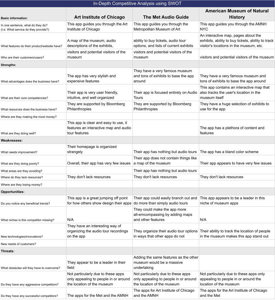
Competitive Analysis
These are three other apps made for other comparable museums. Analyzing these allows us to learn from the successes and mistakes of other apps and brainstorm ways to improve upon existing ideas.
Art Institute of Chicago
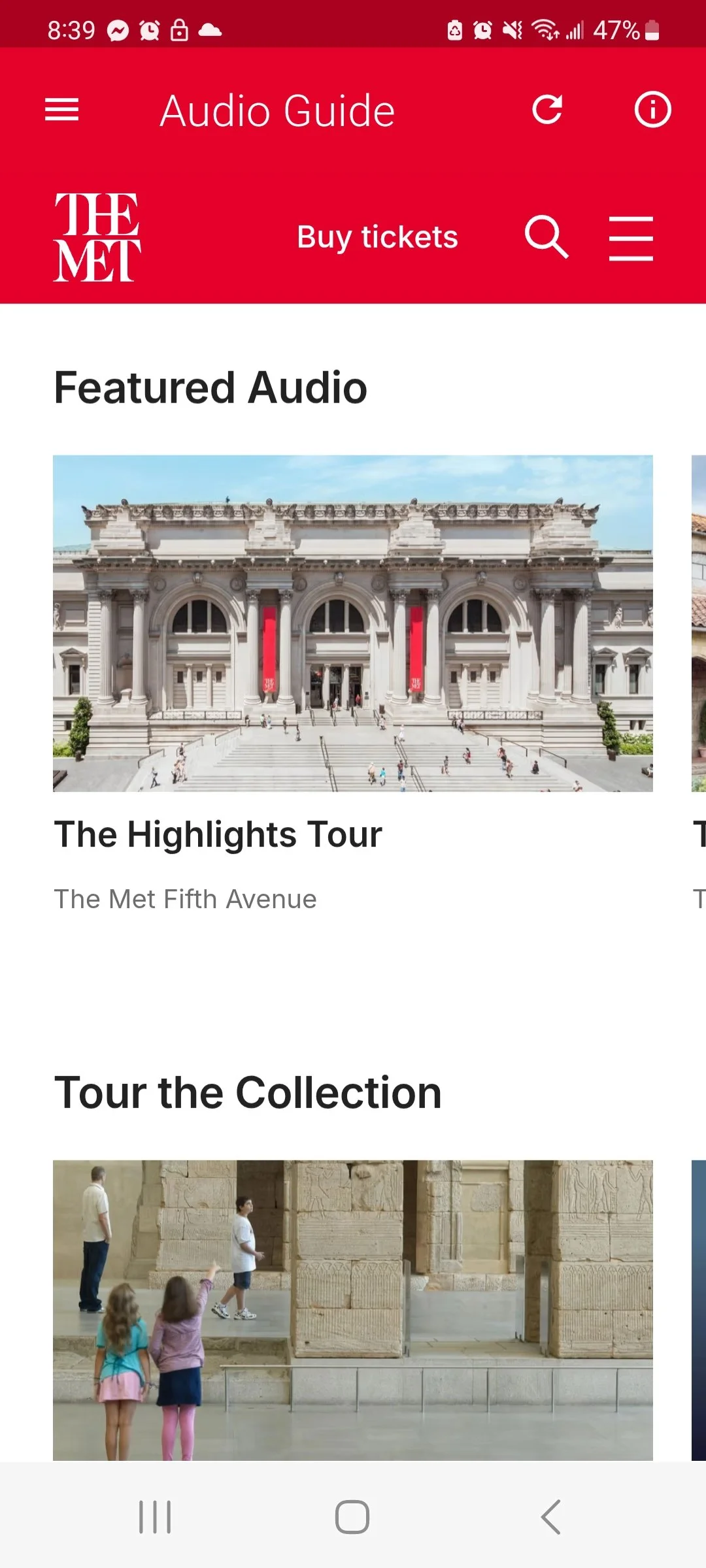
The Met Audio Guide
American Museum of Natural History
SWOT Chart
Research Methods
User Interviews: 5 Participants
1 on 1 Interviews over the phone
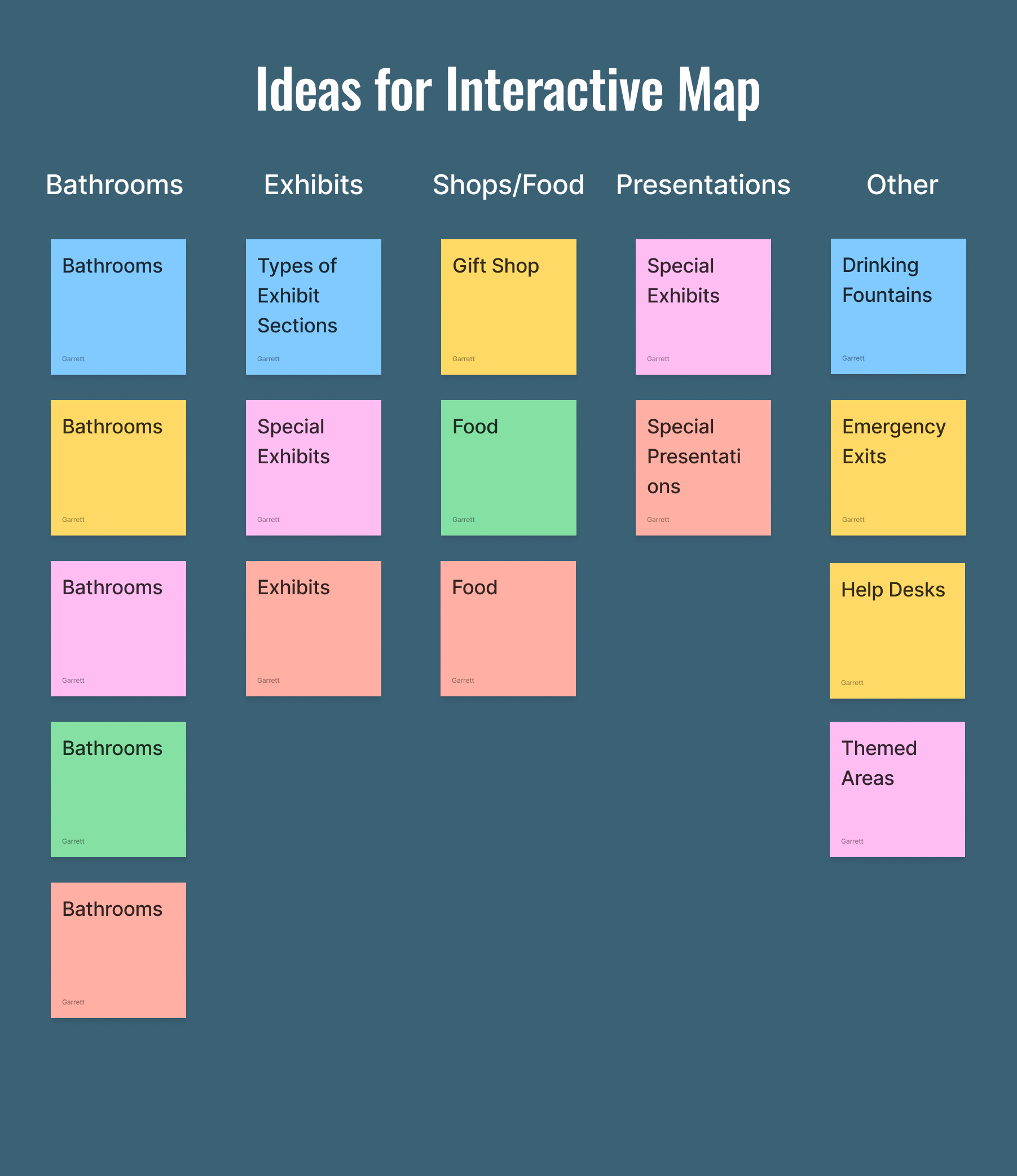
Affinity Map
This allows the data from the interviews to be organized and categorized visually. Each color represents a different interview participant
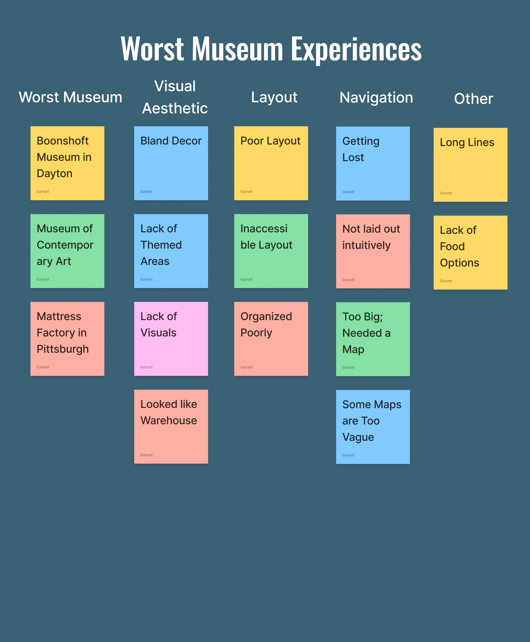
4 out of 5 interviewees expressed similar reasons for liking the museum experience including seeing impressive art and learning new things.
5 out of 5 stated their frustration with navigating larger museums and expressed interest in a better way to find their way through the facility.
2 out of 5 applicants introduced the unique idea of allowing visitors to rate the exhibits so that the museum can use that feedback in the future.
Research Findings
1. Some visitors have trouble finding the location of certain exhibits they are looking for at the museum.
- How might we help customers find the right exhibits at the museum?
2. Many visitors would like to know more about certain exhibits at their own pace without having to follow a tour guide.
- How might we help customers learn more about certain exhibits using the app?
3. Users need a convenient way to buy tickets to the museum.
- How might we provide a convenient way for customers to buy tickets through the app?
Problem Statements
Who is this app for?
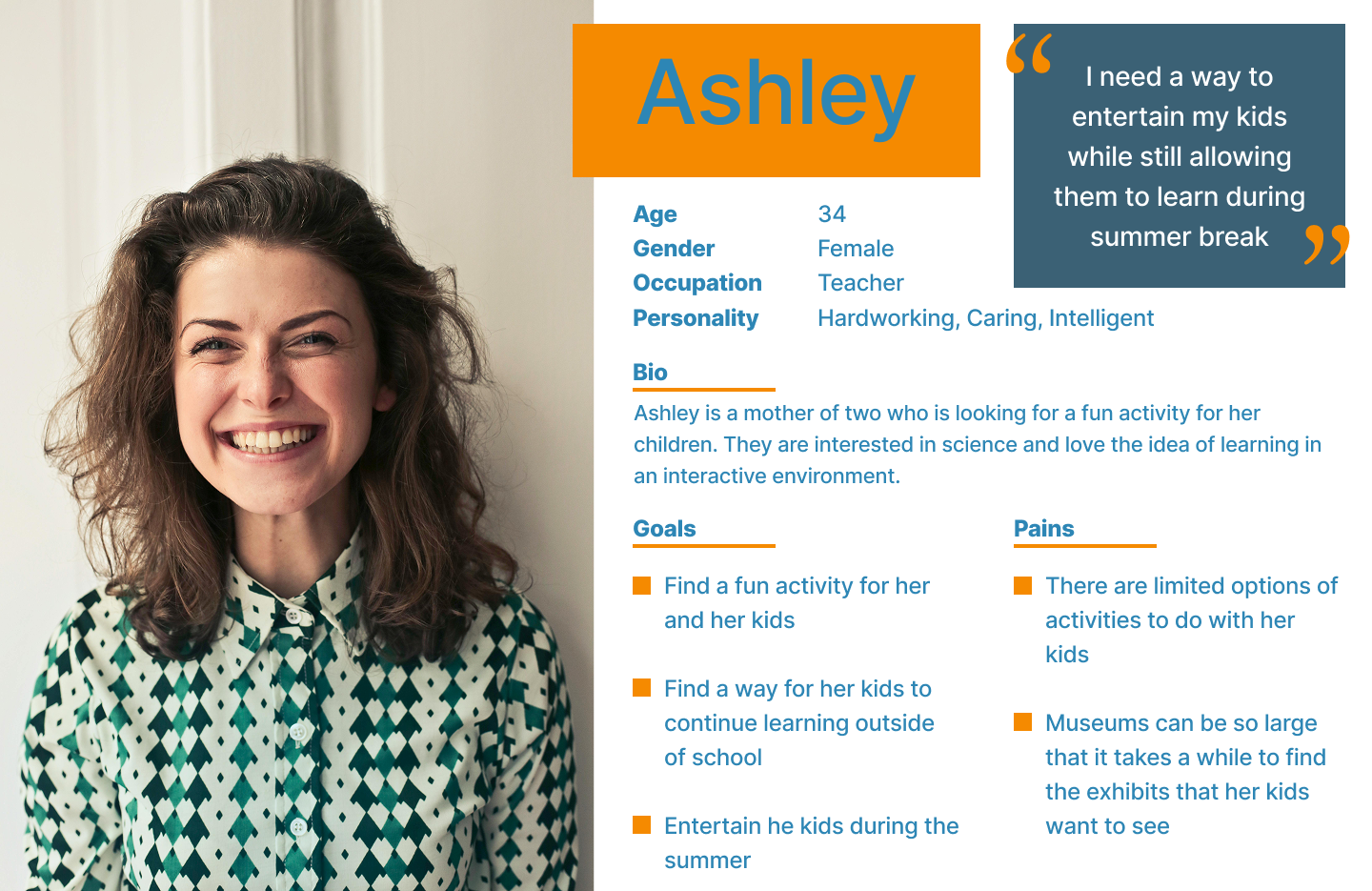
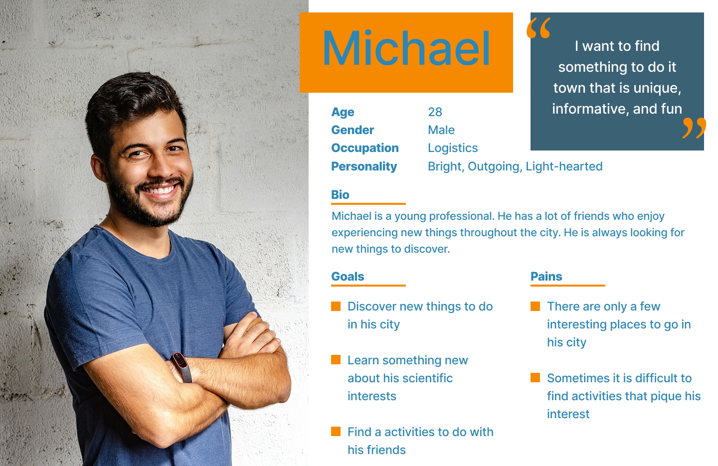
Creating user personas helps to define the target demographic of the app
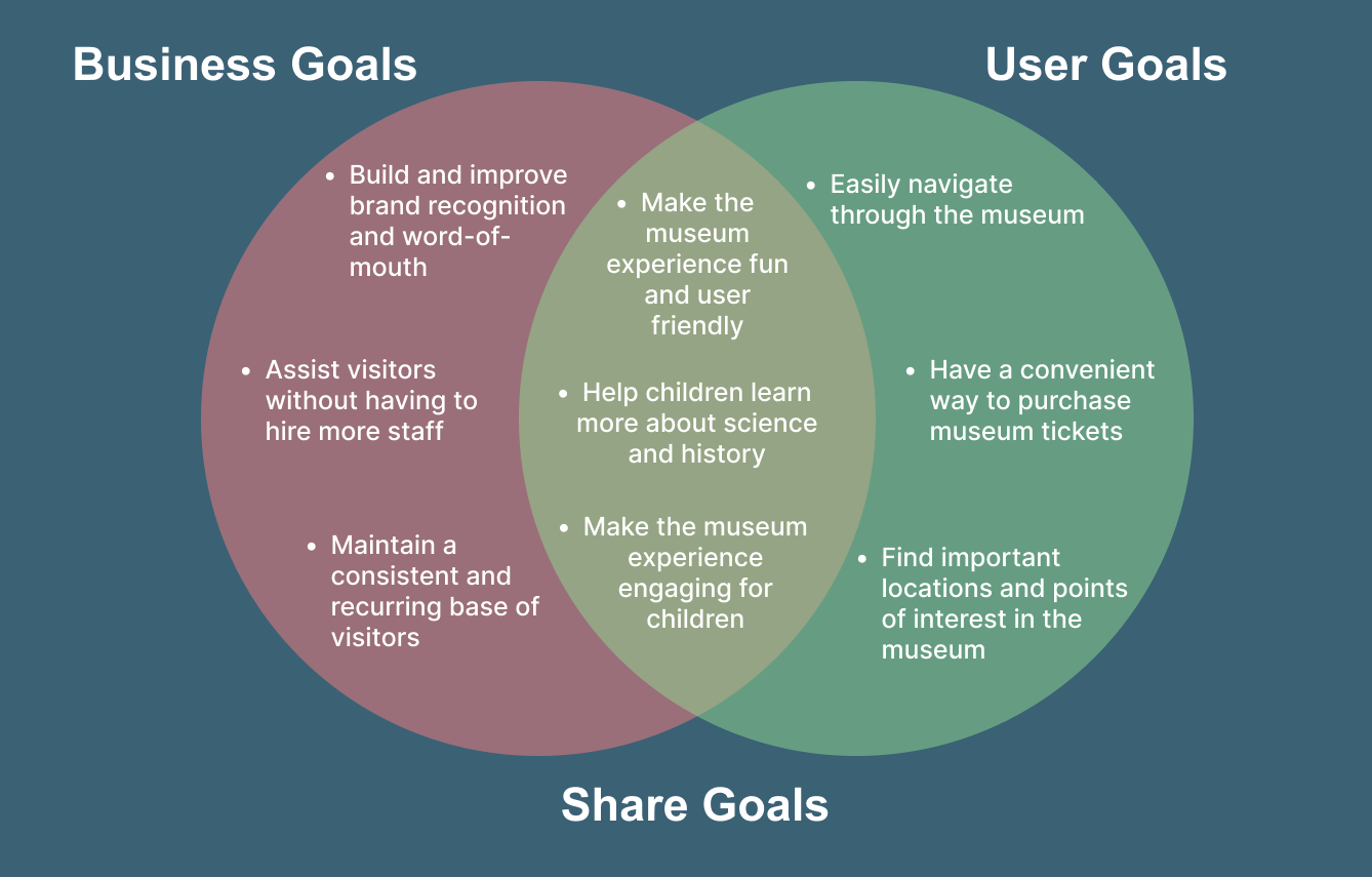
Project Goals
A Venn diagram visually conveys the goals of both the business and the users
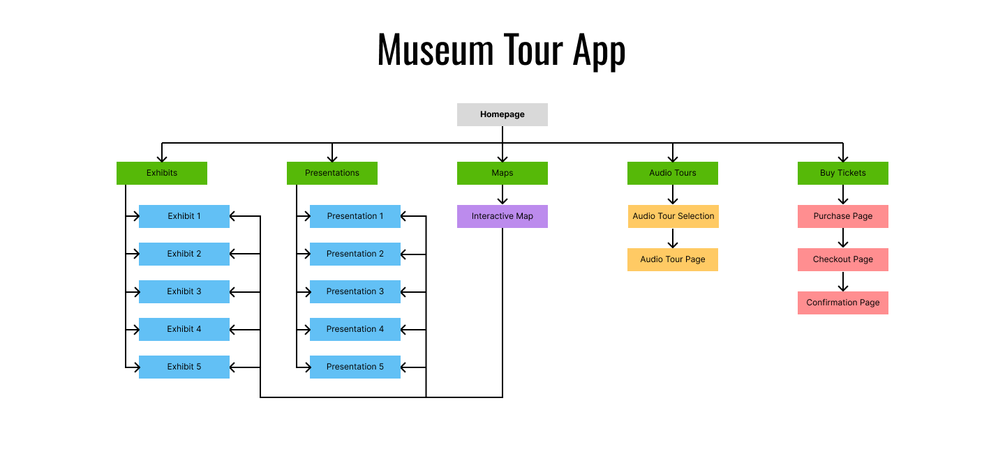
Site Map
Creating a site map helps organize how each page and screen of the app will connect
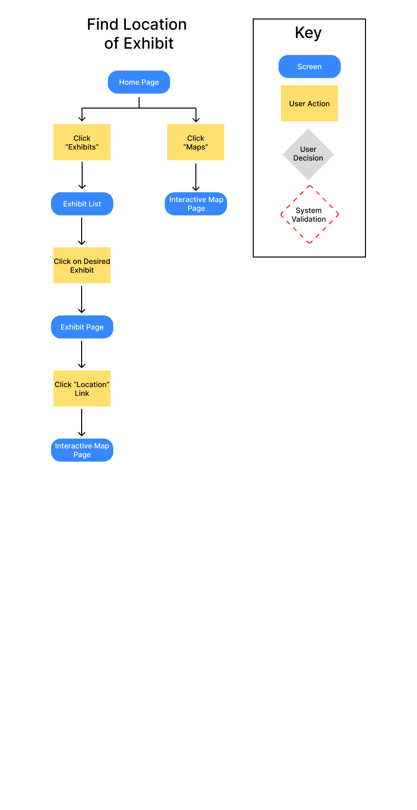
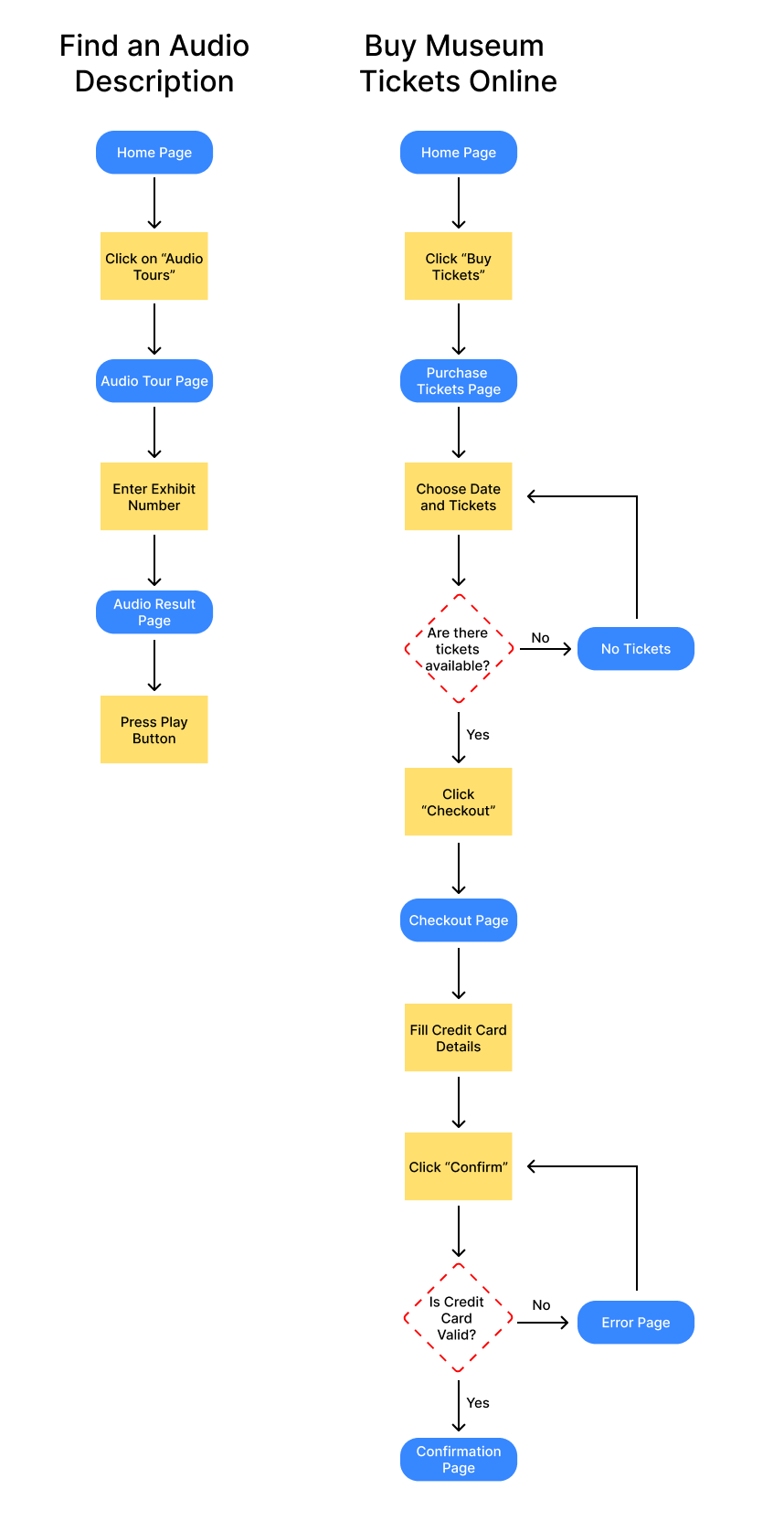
User Flows
This displays the actions and paths that the user will take when navigating the app
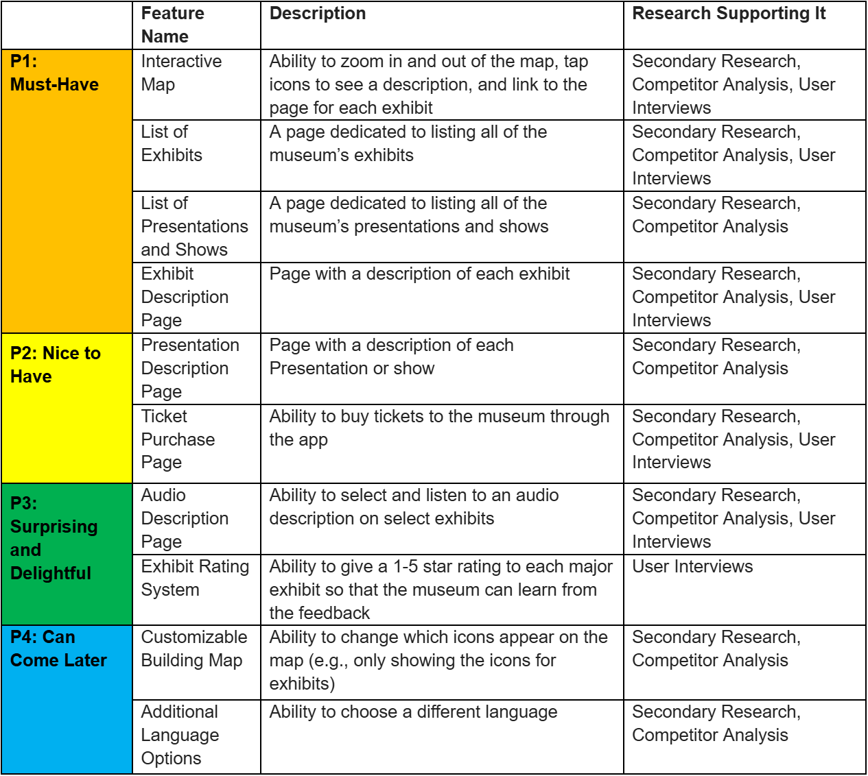
Feature Set
This chart helps to list and display each of the desired features for the app. It also helps to prioritize with features are essential and which ones can come later.
Low Fidelity Wireframes
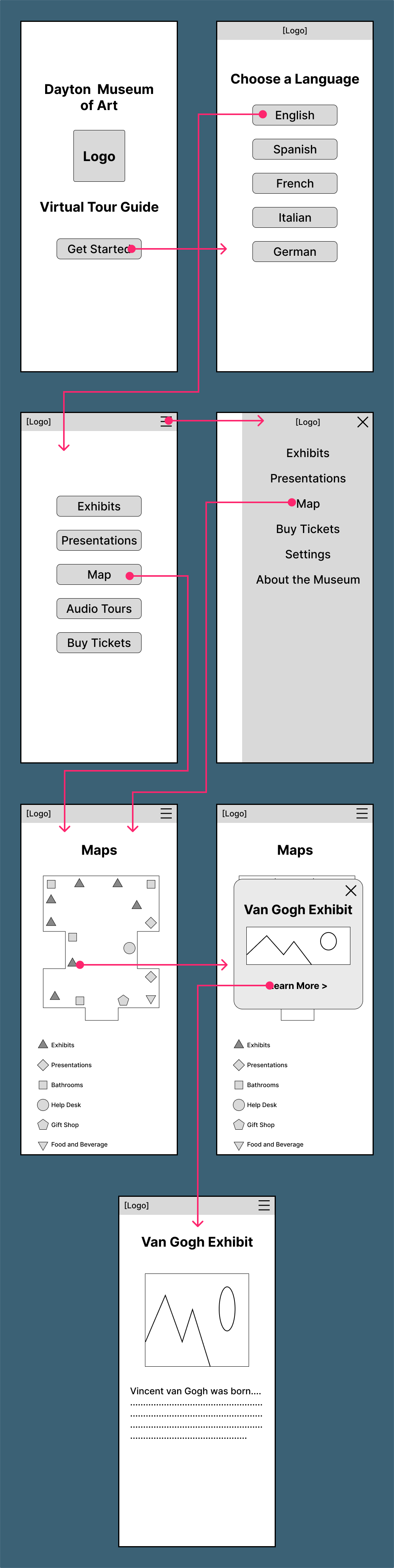
Lo-Fi mockups of each of the key pages of the app allow for a visual representation of the app’s layout and can be used for usability testing
Testing My Ideas
The Lo-Fi Mockups can be used to observe how users navigate the app and identify any issues with the design and layout of the app
Age: 32-42 Gender: 50% Male 50% Female
Testing conducted remotely via Google Meet
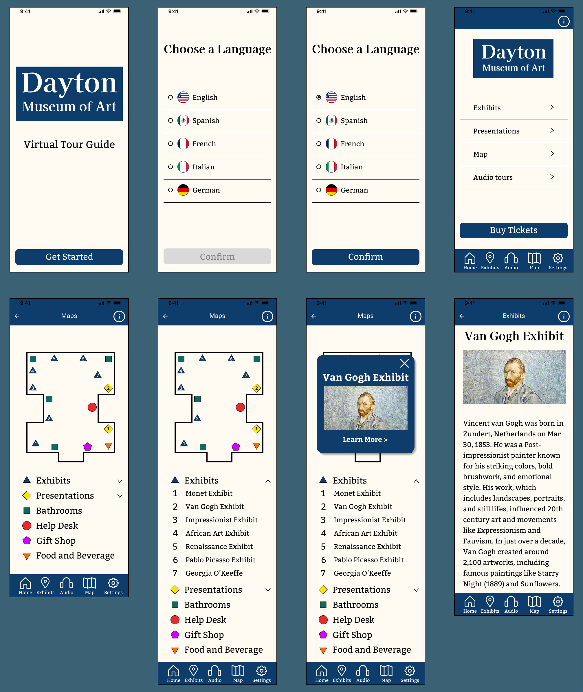
Test participants were asked to locate the museum map in the app and find information about the Van Gogh exhibit.
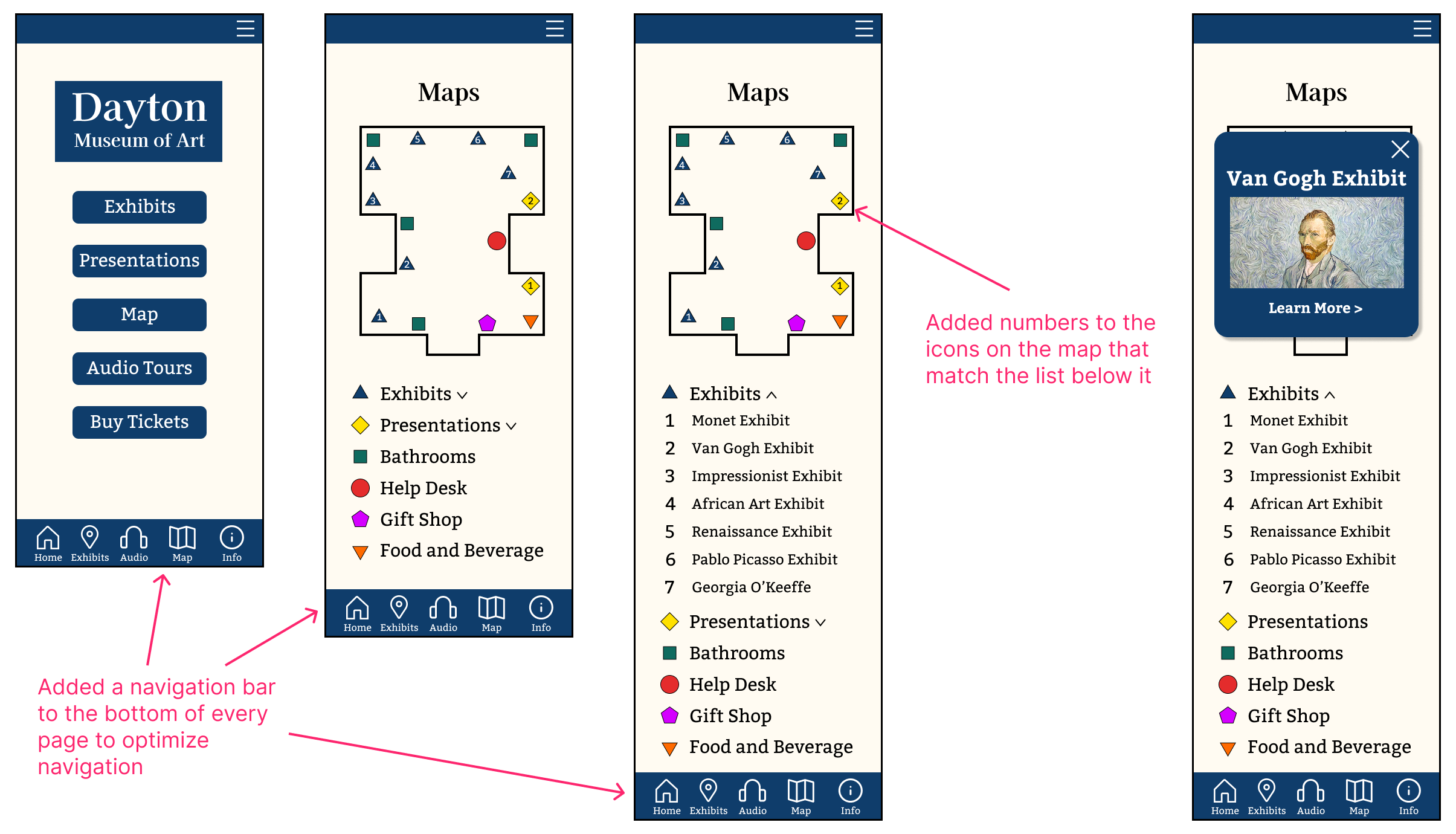
4 out of 4 participants had no issue finding the map in the app. However, they did have trouble finding which icon on the map corresponded to the Van Gogh exhibit
2 out of 4 participants suggested adding numbers to the map icons that match the list of exhibits below
1 out of 4 participants recommended adding the main menu navigation options to a banner at the bottom of each screen
Test Results
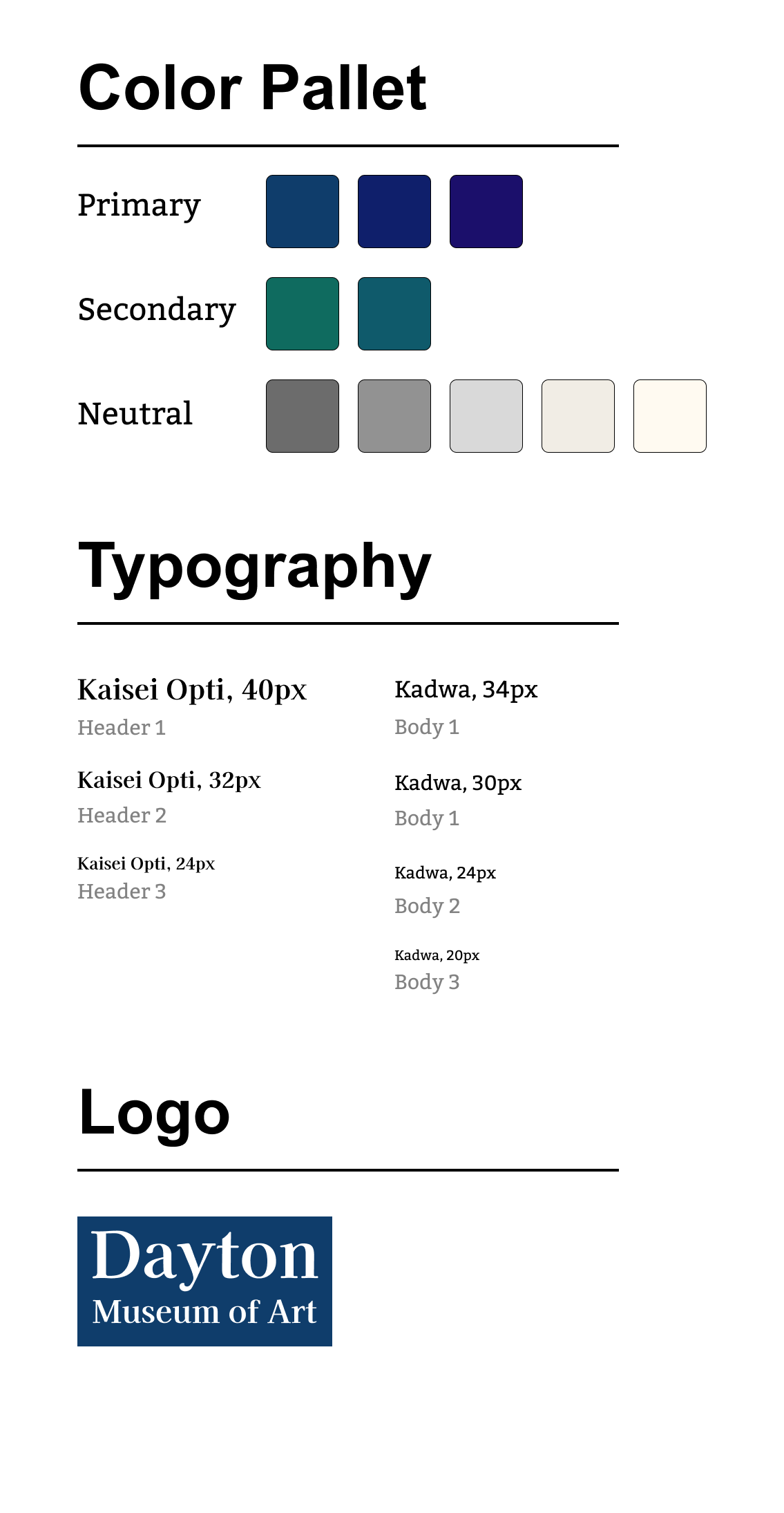
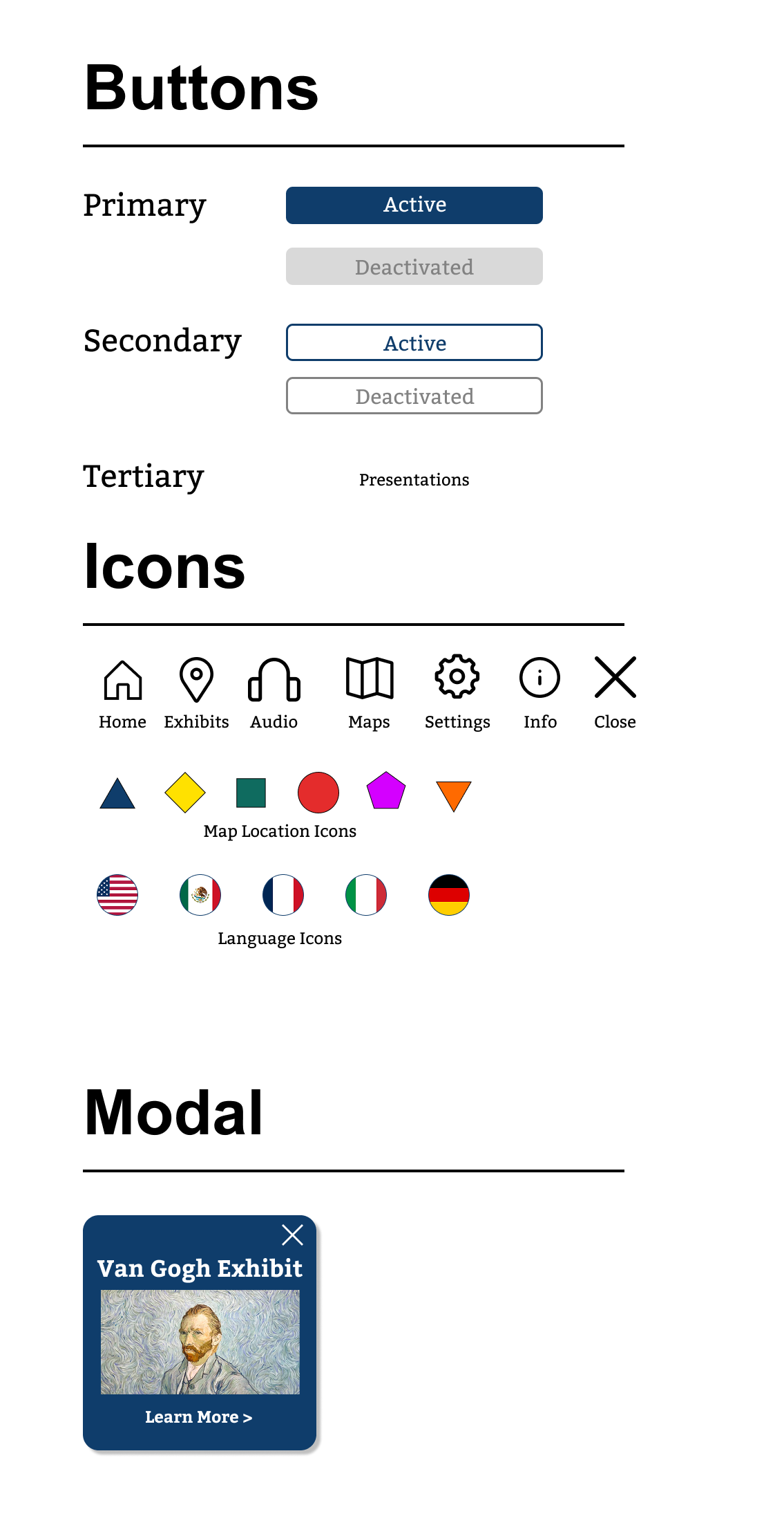
Establish a Style
Creating a Style Tile helps to plan the color pallet, design, and overall vibe of the app. This color palette was chosen because dark blue has a feeling of sophistication. It is a cool and inviting color, which matches the tone of being in the museum where the user will be using the app. The logo design has a simplistic, yet professional design that incorporates the same color scheme.
Iterate on the Design
Now the app has to be updated and redesigned based on the results of the usability tests
Incorporate the Style
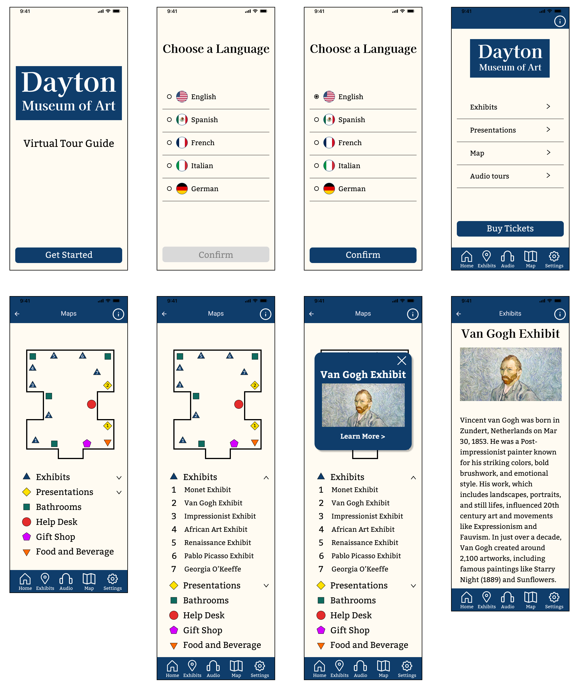
High fidelity mockups allow us to apply all of the ideas and aesthetics from our process so far to convey what the final app will look like
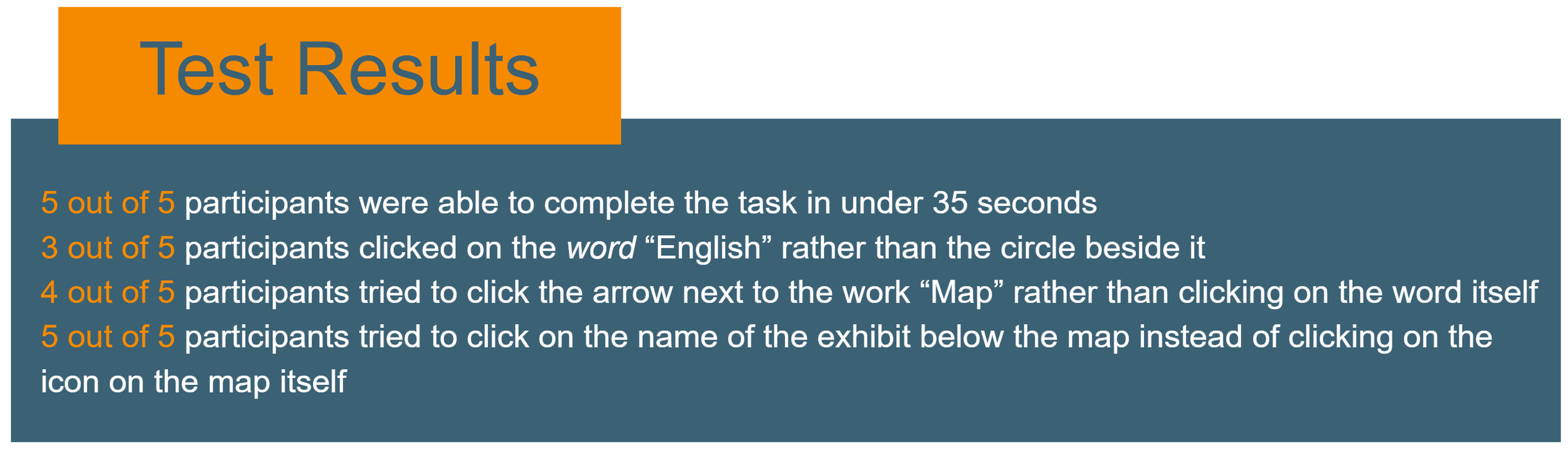
Final Usability Testing
This final user test will help identify any final tweaks the design may need to improve the final product
Age: 29-40 Gender: 40% Male 60% Female
Testing conducted remotely via Google Meet
Test participants were asked to locate the museum map in the app and find information about the Van Gogh exhibit. All of their actions were observed and timed
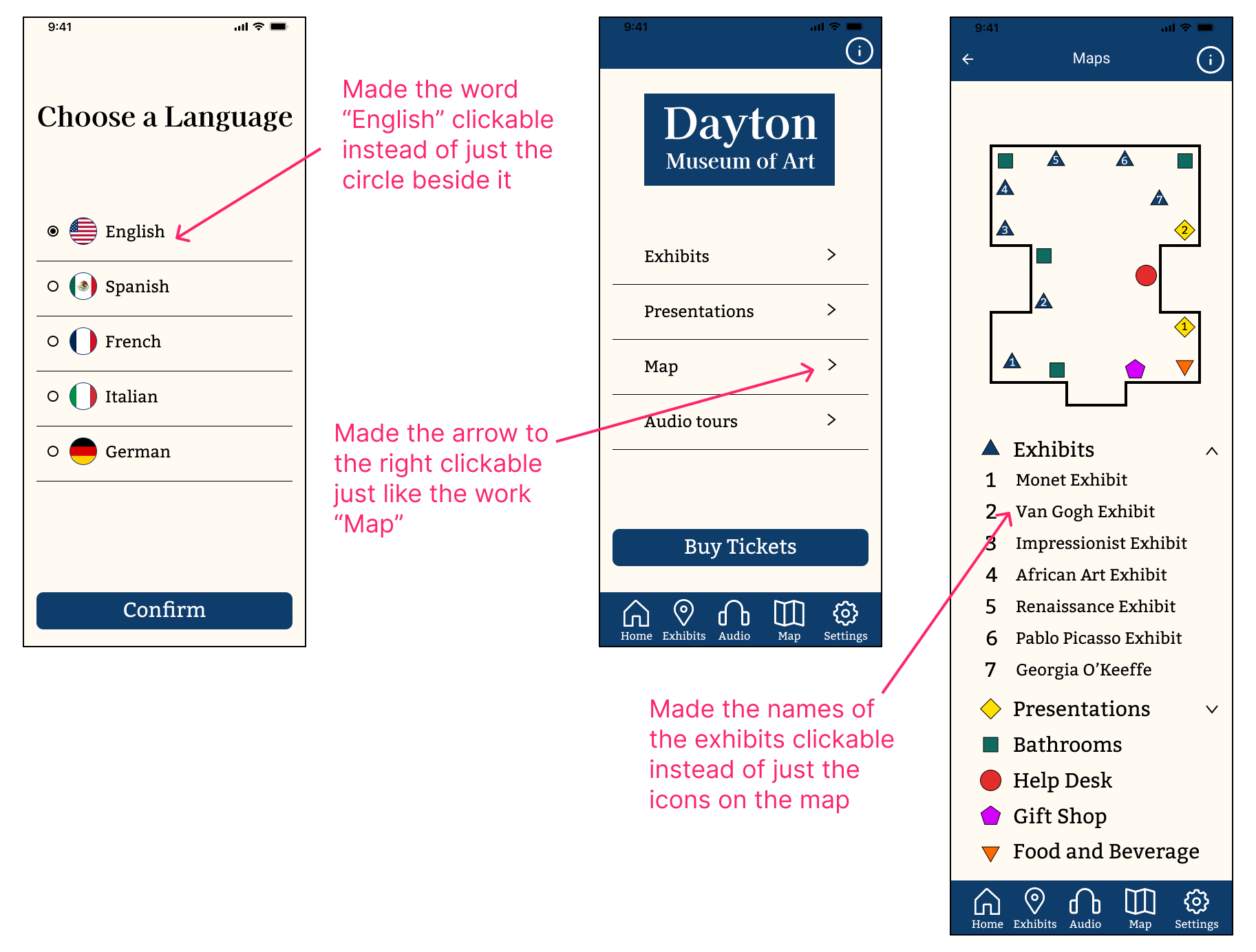
Final Iterations
This is the final step toward perfecting the design, layout, and functions of the app
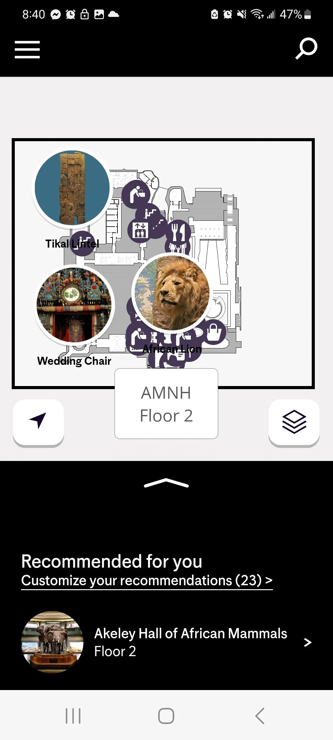
Final Prototype
This is a fully interactive version of the app design
Final Design
After numerous tests and iterations, the design of the app is finalized!